Can you name one big brand that made a profit for over 30 years without having an officially branded visual identity? What is a visual identity? Take me saying to you, I want to get one product from Nike or Apple, your brain does not remember the font and style of the brand name but quickly clicks on the logo in your brand, right? And what do people generally do when someone creates a company? The company looks for a perfect logo that will reflect its values and connect with its consumers. However, this brand did something different. Did you guess the name? It’s none other than the UNILEVER. The Unilever logo history is quite interesting. So, stick around as we are going to have a glimpse at everything.
Let’s look closer at the Unilever logo history
Unilever was formed on September 9, 1929, through the merger of Lever Brothers-the British soap manufacturer-and Margarine Unie, the Dutch margarine producer. Both companies approached the unification with ample experience: while Lever Brothers had its roots in producing soap since the 19th century, Margarine Unie started from the lively markets for butter and margarine in the Netherlands.
The merger was done with an aim at achieving stable raw material sources during a period of intense competition. Thus it could build on a wide diversity of product portfolios for the newly merged entity. You see, soaps, detergents, margarines, cooking fats, salad dressings, ice cream, toiletries, even packaged foods. The outcome company, Unilever, became a global company with an Anglo-Dutch ancestry—an ancestry that still has a momentum in its business practices today. This is part of the broader Unilever logo history that reflects its rich heritage and evolution over the years.
The Twin Towers
The first corporate logo for Unilever was designed in 1969. The design made iconic with it a letter “U” in an abstracted form. Well, guess what? It had vertical lines bearing resemblance to the Twin Towers of the World Trade Center. The bright blue-white color scheme aimed to deliver feelings of trustworthiness and reflect a trend that felt modern and innovative in consumer goods. This initial logo represented the aspirations and vision that Unilever had in becoming a new meta-corporation after the merging of two influential entities. This is a glimpse into the Unilever logo history.
Significance of the Twin Towers Logo
The Twin Towers logo is symbolic, representing the unification of Lever Brothers with Margarine Unie. The art work creates an aura of power, reliability, and trustworthiness. Finally, it epitomizes the aspiration of Unilever to be a market leader in consumer goods. These elements resemble the Twin Towers logo, providing elegance and corporate stability to it. The consumers and all the stakeholders were interfaced by this. The branding gave a single identity to two companies in an integrated manner, thus showing unity and quality product commitment. This is all part of the Unilever logo history.
Description of the 1969 Logo
A letter “U” is stylized to give representation of the company name in an off-Trad mark in 1969. The vertical lines of the “U” reminded people about the Twin Towers, so it immediately made a strong visual connection. The Unilever logo history and the blue-white color scheme brought about a friendly and fresh image. This made the brand more accessible to the consumers. The shade of blue could represent reliability and professionalism, and white conveyed purity and simplicity. It was this combination which improved the overall perception of Unilever products.
Impact of the Logo on Unilever’s Brand Image
The logo in 1969 impacted the brand image that Unilever had in the earlier years. It helped establish the company as a trustworthy entity in the consumer goods sector. Its elegant design and form to represent the Twin Towers communicated strength and stability, thus fostering consumer confidence in Unilever’s products. By this time, the Unilever logo history had matured into the heart of the brand’s identity until the 2004 redesign. Essentially, this would leave a strong implication on reliability and quality with the Unilever brand. The shift would allow Unilever’s narrative on sustainability and innovation to be taken further toward adaptation and resonance with current consumer values in an ever-changing market.
The 2004 Logo: Reasons for the Redesign and its Symbolism
Several reasons precipitated the redesign of the Unilever logo in 2004. This is an interesting aspect of the Unilever logo history. The logo must represent a modern lifestyle. It should better reflect values that consumers currently hold. Additionally, it needed to sever ties with associations to the Twin Towers. This became an issue after September 11, 2001.
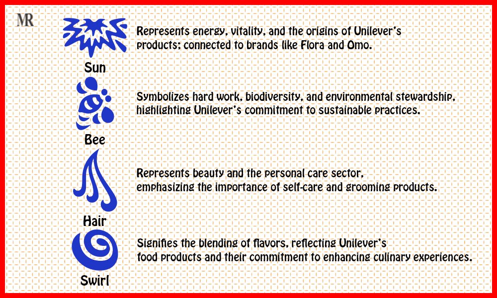
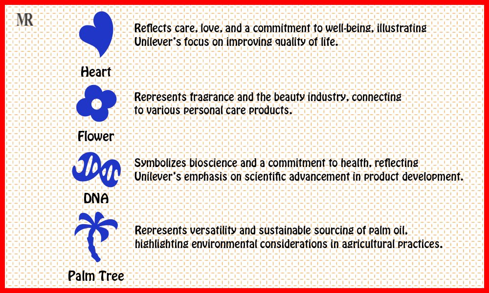
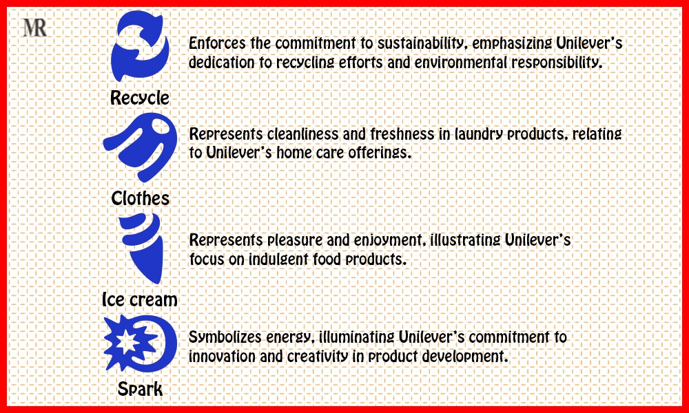
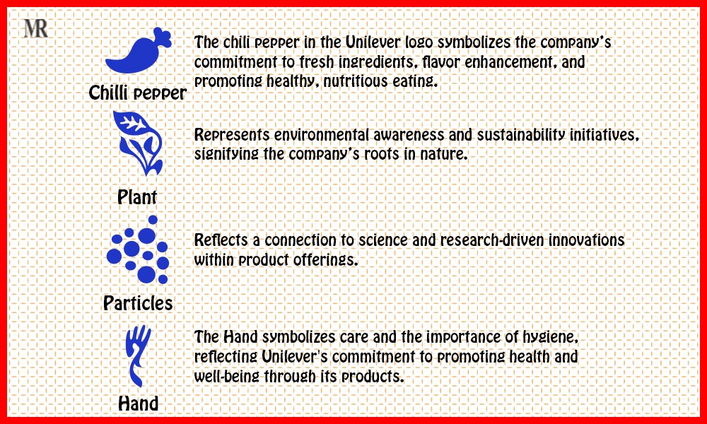
The new logo uses the distinct blue “U” made from 25 icons to show all the sub-brands, products, and corporate values of Unilever. All these signify the corporation’s intention to reflect a sustainable and responsible business model in its operations.
The change aimed to facilitate recognition of the brand while conveying a much-needed message regarding responsibility toward issues surrounding the environment and society.
Detailed Analysis of the 2004 Logo
The 2004 Unilever logo appears almost aesthetically beautiful when considered in isolation because it consists of 25 unique icons in the letter “U.” Hence, each of the 25 icons shows a particular aspect of what Unilever does. This elaborate design thus becomes a great representation of the complete approach by the brand to sustainability and community engagement, making it a key part of the Unilever logo history. It symbolizes elements that range from environmental stewardship to personal care, emphasizing how interconnected operations by Unilever are in nature.


Significance of the 2004 Logo in Reflecting Unilever’s Commitment
The logo of 2004 clearly seems to be a strategy shift at Unilever to sustainability and social responsibility. With regard to the various icons used, the logo signifies proper environmental stewardship and ethics. This would be an outward manifestation of the “life force to life” core purpose of Unilever: not only would be embodied in the company’s products, but also in some of the company’s initiatives aimed at mitigating potential adverse effects on the environment. Besides, Unilever hopes to make good lives for communities around the world. The Unilever logo history will represent direct connectivity of the values associated with the company and the consumer. It represents the essence of this being a responsibility age. Therefore, due to this very crafty revamp, Unilever conveys its commitment to being sustainable in the future. This is why it is an excellent example of branding in consumer goods.
How Unilever’s Logo Reflects Its Brand Values
The Unilever logo, which has undergone a design in 2004, carefully ties to the reputation of the company with sustainability. The Unilever logo history reveals 25 different icons that symbolize Unilever’s commitment to common sustainable living. For example, the plant icon represents the aspect of sourcing in a sustainable manner, while the recycle icon stands for trying to reduce waste in the most efficient manner. Such visual elements correlate well with values associated with sustainability and promise to customers about the concern of the brand towards the planet.
The logo also symbolizes innovation, on which Unilever focuses more. Incorporating features like dust particles suggests that the corporation is keen on scientific research. This means the company seeks to sustain a better lifestyle for consumers through new product research and innovation. This connection with research and innovation drives healthy functional and sustainable products that depict a readily adaptable nature in the fast-moving marketplace.
How the Logo Conveys Trust, Innovation, and Global Presence
Trust
Adding impact to communication of trust and reliability are the design elements of the Unilever brand logo. Blue is very stable, and such color strongly makes the brand believable. The large, bold U stands for “Unilever” and “you,” which means customer-first approach. This thoughtful design development strikes a visual chord with consumers and allows them to feel a sense of belonging and to trust the brand’s values and commitments.
The Unilever logo history features the use of various icons on the logo, representing Unilever’s commitment towards quality care. For example, a heart shape shows its interest in health-related matters, as well as how the slogan “Care for a Living Planet” gels with the incorporation of a plant icon symbolizing commitment toward being green stewards.
Innovation
Innovation bursts into the logo in dynamic design and scientific advancement representation. The icon of particles represents the research-driven development pledge of Unilever. This focus on science thereby reinforces the effectiveness of Unilever’s products, providing a positioning edge of being the leader amongst innovators within the competitive consumer goods landscape.
The Unilever logo history showcases how the logo’s integrated symbols also tell a story about the Unilever mission; that is, it is not only about customer delight but also about solution delivery to tackle global challenges. These include health and nutrition issues, on one hand, and environmental issues, on the other hand. Thus, the above narrative reinforces Unilever’s innovative positioning and an ability to respond to shifting consumer preferences.
Evolution
The Unilever logo history is an echo of the globalization involved with the company. It recently changed the logo from a simple symbol to a symbol that would represent the large portfolio of brands and products by Unilever in 2004. The 25 symbols depict the diversity of the different products as well as the firm’s ability to push through across different cultures and languages.
This is further represented by the logo, which shows that the company is capable of reaching consumers across the globe. It has the capability of displaying close relationships, which exist between different markets and communities. For example, the tea symbol stands for good sourcing in tea plantations, and the symbol of ice cream illustrates indulgence—the something the whole world can easily aspire to.
Conclusion
The Unilever logo history represents the unique path the company has taken. Its history began from having no proper logo, then into its first design in 1969 when it represented the Lever Brothers and Margarine Unie merger. The symbol of the Twin Towers represents the strength and sturdiness, but in the redesign of 2004, it shows the way towards sustainability and innovation. With 25 icons which represent the different products and values of Unilever, the updated logo indicates responsibility towards nature and progress. These changes indicate how logos evolve to come up with corporate identity, build trust in consumers, and convey the core mission of the brand.