Pepsi is one of the most iconic brands in the world today, but its logo wasn’t always the sleek design we know. Over the years, the history of Pepsi logo has seen major transformations, each reflecting the era and trends of the time. From its early designs to the bold, modern look, Pepsi’s logo has always been about staying fresh and relevant.
In this journey, we’ll explore seven key moments that defined the evolution of Pepsi’s logo. These moments capture how the brand’s identity shifted, adapted, and connected with consumers through the decades. Let’s take a closer look at how it all unfolded!
Here are the 7 Must-Know Moments from the history of Pepsi Logo
1. The “Pepsi-Cola” Name Origin
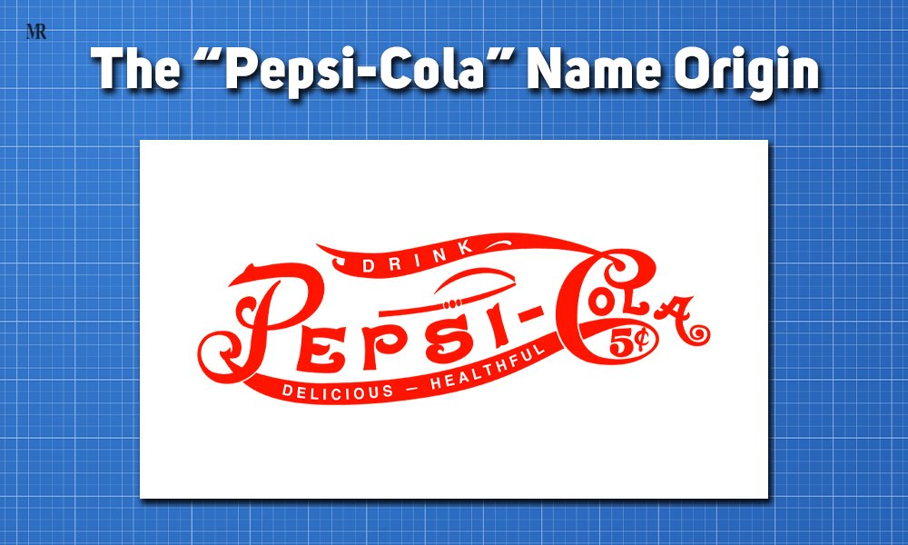
In 1893, Caleb Bradham, a pharmacist from North Carolina, introduced a drink called “Brad’s Drink” at his pharmacy’s soda fountain. This refreshing mixture of sugar, caramel, lemon oil, kola nuts, and other ingredients quickly gained popularity. Bradham believed his drink could aid digestion, making it a hit with customers seeking both taste and health benefits. On August 28, 1898, Bradham rebranded it as “Pepsi-Cola,” referencing pepsin, a digestive enzyme, and kola nuts. This marked the birth of the first official logo and the foundation of the history of Pepsi logo.
The renaming to “Pepsi-Cola” was a pivotal moment for the brand. It allowed Pepsi to stand out from competitors, especially Coca-Cola, by emphasizing its health-related benefits. The first logo for Pepsi further reinforced its identity, offering instant brand recognition. This change set the stage for Pepsi’s long-term branding success, as it allowed the company to craft a unique image that appealed to health-conscious consumers while still providing refreshment.
The rebranding quickly enhanced Pepsi’s market position. By 1902, Bradham officially incorporated the Pepsi-Cola Company, selling nearly 8,000 gallons of syrup in its first year. By 1910, Pepsi had over 240 franchises across 24 states. The clear brand identity and growing market demand positioned Pepsi as a rising competitor to Coca-Cola, making the early shift in its branding and logo a key moment in the history of Pepsi logo evolution.
2. The 1940s Bottle Cap Design
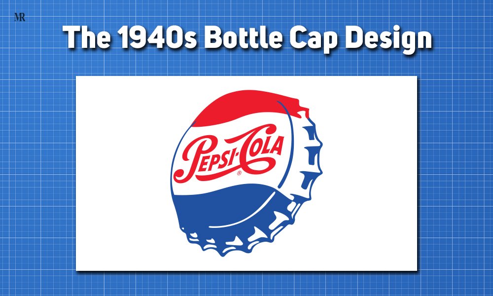
The 1940s were profoundly influenced by World War II, which reshaped American society and consumer behavior. As the nation rallied behind the war effort, brands aimed to connect with patriotic sentiments. Pepsi-Cola seized this opportunity by introducing a bottle cap design featuring red, white, and blue colors, symbolizing American pride and unity during wartime. This design was more than a marketing strategy; it represented a collective national identity, resonating with consumers eager to support American-made products.
The bottle cap design of the 1940s became iconic for several reasons. First, its use of red, white, and blue directly linked Pepsi to American values. This strategic choice fostered loyalty among consumers wanting to support brands that echoed their national pride. Additionally, the circular design resembled military insignia, helping Pepsi create a memorable visual identity that distinguished it from competitors like Coca-Cola. The simplicity and boldness made it easily recognizable.
The introduction of the patriotic bottle cap design had significant market implications. During WWII, consumers gravitated toward products that evoked patriotism. Pepsi’s clever marketing strategy tapped into this sentiment, leading to increased brand loyalty. The bottle cap became synonymous with American pride, appealing to those wanting to support their country. In 1941, Pepsi’s revenue was close to hitting $10 million. The total revenue was $9.3 million, which reflects the success of its strategies. This design not only boosted sales but also laid the groundwork for future branding efforts in the history of Pepsi logo.
3. The 1950s Pop Art Influence
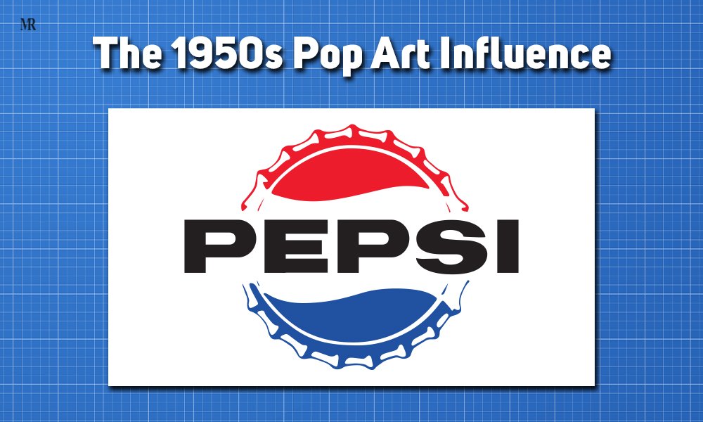
The 1950s marked a significant cultural shift in America with the rise of the Pop Art movement. This artistic trend embraced consumer culture, using bold colors and dynamic graphics to reflect societal changes. Recognizing this, Pepsi-Cola incorporated vibrant design elements into its branding, aligning with the post-war surge in consumerism. The Pop Art movement celebrated mass-produced goods and resonated with the emerging baby boomer generation.
During this decade, Pepsi’s logo design evolved into a more modern and youthful look. The incorporation of bright blue alongside red and white evoked patriotic feelings while embracing the Pop Art aesthetic. The slogan “More Bounce to the Ounce” emphasized fun and enjoyment, establishing Pepsi as a brand about refreshment and lifestyle.
This embrace of Pop Art positioned Pepsi as the youthful alternative to Coca-Cola. By appealing to the baby boomer generation, Pepsi’s market share significantly increased. From approximately $20 million in 1950, sales soared to over $40 million by 1955. This strategy solidified Pepsi’s cultural relevance and enhanced its identity in the history of Pepsi logo.
4. The 1998 Gradient Effect
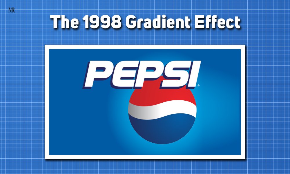
The late 1990s brought significant technological advancements that transformed marketing and design. In 1998, Pepsi introduced a new logo featuring a gradient effect, thanks to improvements in printing technology and digital design tools. This change allowed for complex color transitions, creating a three-dimensional appearance. The logo shifted from a flat design to one with a gradient background, giving it a modern and dynamic look. This pivotal moment is a key point in the history of Pepsi logo.
This redesign represented a significant modernization of Pepsi’s visual identity. The gradient effect provided a futuristic look that symbolized innovation and progress. As consumers became increasingly tech-savvy, they gravitated toward brands that reflected contemporary aesthetics. Thus, the sleek design marked a departure from previous iterations, appealing to younger demographics and ensuring the brand stayed relevant.
The introduction of the gradient effect had notable market implications for Pepsi. The modernized logo positioned Pepsi as a youthful, fun alternative to Coca-Cola, particularly appealing to Generation Y (millennials). Following the logo change, Pepsi experienced increased brand visibility and relevance. By 2000, Pepsi’s market share had risen to 13.5%. This significant growth reinforced its position as a forward-looking brand in the history of Pepsi logo.
5. Hidden Meanings in the 2008 Redesign
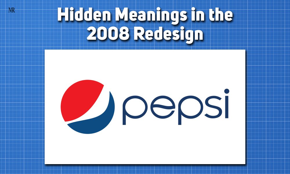
The 2008 redesign of the Pepsi logo introduced a circular shape packed with hidden meanings. The history of Pepsi logo can be traced back to this round design, which symbolized balance, hinting at Pepsi’s goal to create a harmonious connection with consumers. This balance conveyed stability, assuring customers of the brand’s reliability. Additionally, the design was inspired by the earth’s gravitational pull, symbolizing Pepsi’s global presence. By embedding such elements, the new logo reflected Pepsi’s universal appeal and cultural relevance. Lastly, the slight curvature in the logo represented a forward-thinking attitude, signaling Pepsi’s readiness to embrace innovation and progress.
The redesign marked a shift in Pepsi’s brand identity. Looking back, the history of Pepsi logo, the move from, a three-dimensional globe to a flatter, minimalist design indicated a more dynamic approach. This transformation aligned with the design trends of that time, emphasizing simplicity over complexity. The new logo also communicated Pepsi’s desire to attract a younger, more adaptable audience. By embracing fluidity in its branding, Pepsi showcased its ability to evolve with changing consumer preferences and positioned itself as a more forward-looking brand.
Pepsi’s 2008 logo change had a noticeable impact on its global market strategy. The history of Pepsi logo shows how the circular design made Pepsi more culturally aware and relatable across different international markets. This global recognition helped strengthen Pepsi’s appeal to consumers who valued brands that merged cultural relevance with global identity. Moreover, the logo’s symbolic storytelling deepened consumer engagement, as it invited people to connect with the brand on a more meaningful level. In October 2008, the company reported disappointing earnings due to poor drink sales, leading to plans to lay off approximately 3,300 employees. Though Pepsi faced market challenges following the redesign, the new logo played a key role to revive the brand.
6. The “Da Vinci-esque” Document
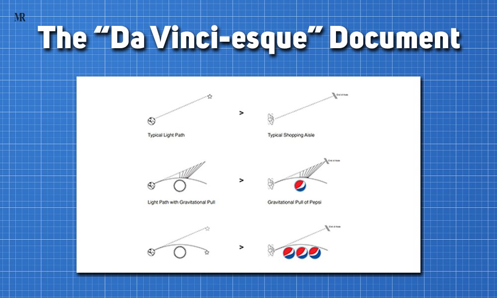
In 2008, Pepsi introduced a bold redesign, accompanied by an intriguing 27-page document created by the Arnell Group. Dubbed “Da Vinci-esque,” this document meticulously mapped the geometry and symmetry of the Pepsi logo, linking its design to historical concepts and mathematical harmony. It drew inspiration from both art and science, adding depth to the history of Pepsi logo by portraying the rebranding as more than just a surface-level change. However, Pepsi reportedly paid the Arnell Group approximately $1 million for this redesign, which included extensive research and conceptualization.
The document highlighted the precision and thoughtfulness behind the logo’s construction. By aligning its new design with artistic and mathematical principles, Pepsi aimed to project itself as an innovative and forward-thinking brand. This moment in the history of Pepsi logo showcased how branding had evolved beyond aesthetics, focusing on conveying deeper meaning through design.
Though the redesign sparked mixed reactions, it generated significant media buzz. Some praised the innovation, while others found the concept overly complex. Despite the divided opinions, the attention surrounding the rebranding stirred curiosity and drove consumer interest. This media-driven discussion further cemented the logo’s place in the history of Pepsi logo, making it a defining moment in how the brand captured public attention.
7. The Unusual Typeface Journey

The history of Pepsi logo has seen significant changes in its typeface, evolving alongside the brand’s identity. Pepsi’s original 1898 logo featured a decorative script, which was ornate and somewhat similar to Coca-Cola’s design. However, in 1962, Pepsi shifted to a bold sans-serif font, leaving behind the cursive style. This change marked a desire to modernize and simplify the brand’s look. In 1987, a custom futuristic font was introduced, which incorporated rounded edges to reflect the digital advancements of the time. By 2008, Pepsi adopted a minimalist, lowercase sans-serif font, signaling a major embrace of clean, readable branding.
Each iteration of Pepsi’s typeface reflects thoughtful design choices aimed at aligning with modern trends. Over the years, the typeface became sleeker and more minimal, moving from ornate scripts to a simpler, more contemporary look. In 2008, the decision to use lowercase letters added a friendly and approachable vibe to the logo. This design choice helped Pepsi build a modern and relatable visual identity, especially appealing to younger audiences who appreciate minimalism. Which also marked another significant moment in the history of Pepsi logo.
The cleaner, more modern typeface positioned Pepsi as a brand in tune with minimalist design trends. This shift allowed Pepsi to appeal to a broader demographic, including style-conscious younger consumers. The typeface change also aligned Pepsi with brands like Apple and Google, whose sleek designs defined the 2000s. In 2008, Pepsi reported revenues of approximately $43.25 billion but also faced declining soda sales amid shifting consumer preferences towards healthier options. Although Pepsi faced challenges in the beverage market at the time, the updated logo helped the brand maintain its position as a stylish and accessible option in competitive global markets.
Conclusion
In summing up, the history of Pepsi logo is marked by seven defining moments that have transformed it into a global icon. From simple beginnings to modern, minimalist designs, each change reflects evolving cultural influences, design trends, and advancements in technology. Pepsi’s logo evolution showcases how a brand can stay relevant through time. Ultimately, it’s more than just a logo—it’s a reflection of shifting consumer preferences and societal progress over the past century.


